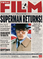

These are a few of the covers I looked to for inspiration. I looked over them to see their formats and layouts, how they placed their pictures and their mastheads. I did my best to combine these styles into my piece to create a magazine/newspaper/tabloid look that worked and could be recognized. I felt that I really captured the texture of the old newspaper with my scanned in newsprint.


No comments:
Post a Comment