
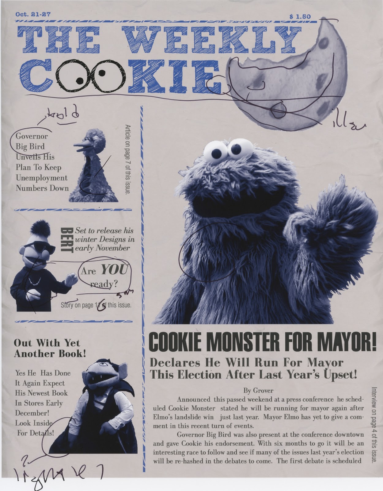
From this point, after getting some feedback, I added a story to get rid of some of the dead space. I moved all of the secondary stories to the left to give it more of a stacked feel and to make it feel like a magazine since most of their stories are on the sides not bottom. I moved the masthead to left justified instead of centered to give more of a feel of a magazine. To fill in the space I had drawn a cookie. I also added body text to the "main" Cookie story to push the newspaper idea even farther.
No comments:
Post a Comment