Thursday, November 29, 2012

Artist Website in progress post 1

 < HTML code for my web page.
< css code for my web page.


 So far I have established the background texture of the page, a red hue with diagonal lines. The header is his signature and I re-created in illustrator from a picture that is at the bottom of this post. I took out the background and recreated it using the pen tool and width tool. I have added 10 divs with alternating colors and have been filling them with content of text and images about John Lasseter. At the very bottom of the page I have a working link to pixar.com.

Also below are all of the original pictures that I have manipulated in photoshop and then added to my webpage. Each picture I resized and for some of them I got rid of the background.


Tuesday, November 27, 2012

 In the first sketch I was thinking of creating horizontal boxes of content and next to the having a picture of some kind that represents the content. It would become a type of timeline, the story of his career (mainly) I thought this would connect back to him since he thought story was so important.

In the second layout I was going to have a header with scanned imagery from the Pixar book I have. On the left there would be a nav bar that would have an illustrator element in it that would be a time line of his life. Then in main content would be important points that would emphasized certain aspects of his life.
Layout three is similar to layout two except this layout has an additional side bar. In the right side bar I was going to possibly add movie posters from all the movies/shorts he has worked on, just to show the large amount. This side bar would work with the created timeline in that it would be it's visual.

The fourth and final layout would have the scanned imagery from the book on the top and bottom and content and visuals together in the main content telling the story of his career.

Sunday, November 18, 2012

Artist Summary


John Lasseter was born in January 12, of 1957 in Hollywood, California. He became a member of the Board Of Governors of the Academy of Motion Picture Art and Sciences in 2005. He is known for his work with Disney and Pixar. He has produced blockbusters made by both companies including Tangled, Toy Story, WALL-E, Ratatouille, Finding Nemo and many more movies and shorts. He also directs, writes, animates and has done voice overs.

Thursday, November 8, 2012

duotone image

 These are the images from an earlier post that I have manipulated. I took all of the images I used and created a mask in the background using the pen tool and hid the background. Next I used the duotone effect shown in class with the blue in the masthead to create a two color print job look to my magazine. I felt that that helped the newspaper effect really work.


Final Magazine Cover !

This is my final magazine cover. Since the in progress I lightened the images and changed the masthead cookie to a vector that had a texture that represented the texture from the text. I added text to the story and moved about some of the text in the sidebar around to allow it to flow better.

In progress

 This was my first layout when I was originally going for a more tabloid-like layout. There was a lot of negative space and only three stories.

From this point, after getting some feedback, I added a story to get rid of some of the dead space. I moved all of the secondary stories to the left to give it more of a stacked feel and to make it feel like a magazine since most of their stories are on the sides not bottom. I moved the masthead to left justified instead of centered to give more of a feel of a magazine. To fill in the space I had drawn a cookie. I also added body text to the "main" Cookie story to push the newspaper idea even farther.
After all of those changes, to my first layout I printed it for Tuesday. The feed back I received on Tuesday included making the cookie smaller and possibly giving it the same texture as the type, making the side bar more narrow to give the main story more presence, lightening the images and some small type suggestions.

Inspiration


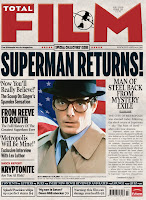
These are a few of the covers I looked to for inspiration. I looked over them to see their formats and layouts, how they placed their pictures and their mastheads. I did my best to combine these styles into my piece to create a magazine/newspaper/tabloid look that worked and could be recognized. I felt that I really captured the texture of the old newspaper with my scanned in newsprint.

Friday, November 2, 2012

Scanned and photographed items

These are the three scans of newsprint I brought in for my magazine. I scanned in newsprint since the theme of my magazine may be a Sesame Street newspaper. I am leaning towards the darker crumpled one because the texture shows up very well and it adds a lot to the piece.


These are the three pictures I am currently working with in my magazine layout. I brought to class many pictures I took on a family trip to Sesame Place a few years ago. The pictures are mainly from the parade and show we saw while there.

Thursday, November 1, 2012


These are the three sets of mastheads I have come up with for my magazine. I have been pursuing two separate names so far, COOKIE and The Weekly Cookie. I thought the addition of the eyes into the typeface directly connects to my theme of Sesame Street. I think that children would realize right away the connection to the character and want to look at it. In the second set I added the blue to allow the eyes stand out even more. In The Weekly Cookie mastheads I was trying to duplicate the style of a newspaper, to add to this idea I added the week and price.