Friday, December 7, 2012
Important note
Something I had forgotten to include in an early post is that I did try to change the name of my folder called background, as well as my HTML file. When I tried it said things could not be found and paths were lost. To prevent confusion or added trouble I left the file names alone. The correct file to open my site is index.html the others are my links included in the site.
Thursday, December 6, 2012
Final website
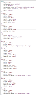

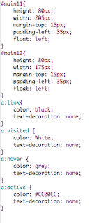
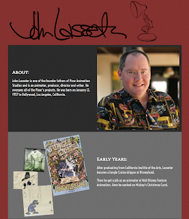
These are screen shots of my final html, css code and of my website. Since my last recap post I have added slightly more content to the About and Early Years. I also added two more links, and changed the styling of them so the links better match with my website. I also lowered the height of the wrapper since I knew my full amount of content now. The largest change was the addition of the colorscripts in the background of each panel. As stated in previous posts I created each one as background image in illustrator and resized and lowered the opacity so each colorscript would work in the space. Once that worked I took the images I had originally collaged and also resized and lowered the opacity on them. This was so I could included them into the colorscript. I did this so the images would be still present but less over powering. This placement also worked with the story board theme better in that it makes it seem that each brighter/separate image is a highlight in John Lasseter's 'life storyboard'.
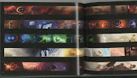
All scanned images
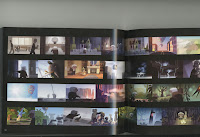
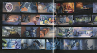
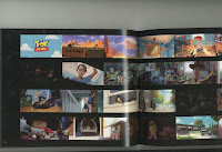
All of my scan ins came from a book called The Art of Pixar. It is a book of colorscripts from 25 years of Pixar animation.
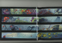 I paged through the book and found memorable sequences from the movies and scanned them in. The movies include Up, Finding Nemo, Incredibles, the short La Luna,
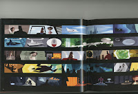 Monsters Inc., and Toy Story 3. Once scanned in I had to crop and cut the scans in photoshop, open them in illustrator and place and lower the opacity.
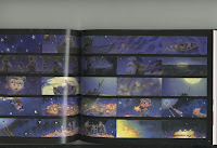 frame each movie would go in I would try to match it up with the content, for example WALL-E's is in the panel where he is mentioned. Also I would try to match it with the title,
La Luna is with the title that has the word spark in it. After I made decisions based on that I placed what was left by what the content could contain. I wanted to include as much of his work as possible so I included movies not otherwise mentioned.
All original images
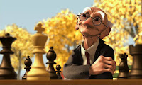
These are all the original images I used within my website. I cropped and lowered the opacity of most of the above images in photoshop and illustrator before putting them into my background images. For the WALL-E picture I created a path around him with the pen tool and got rid of his background so he could hang off the ledge.
Tuesday, December 4, 2012
Class progress
In class I found all of the pictures that I wanted to include that go with the content.
<Once I found them all I took each set into illustrator and manipulated them. I turned, resized and place each image to fit within the div measurements, saved it as a .png then placed my 3 new photo sets into my code. In the screen shot to the left is the 3 image panels I created today.
<For the last set of divs I added in a video. It is the trailer for Wreck-It Ralph, one of his newest projects.
I am planned to possibly brighten the red of the background to work better with the contrast, adding sketches in the background of all of my content divs, adding more links, and hopefully continuing to manipulate my images to make them more dynamic and speak to the style of Pixar.
Monday, December 3, 2012
creation of Luxo
This is the picture I started with in illustrator to create my version of Luxo the lamp. From there I went around the outside of the lamp and traced it out using the pen tool. I then added some details. After that I went in with the width tool and adjusted the thickness and thinness of each line to where I saw fit. In the final image below is the final produce which I saved as a .png to include in my website's header.
Artist Website in progress 2
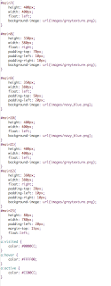
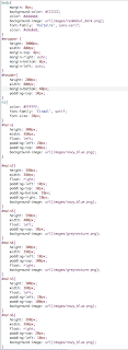
Above are pictures of my html and css code. Since my last post I have finished adding all of my text content. I had to add a set of divs to my design to accommodate for my extra content label recent work. In addition to my link to pixar's website I added a link to my blog as well. As discussed last class I recreated the luxo lamp character in the same style as the signature through illustrator and added it to the header.
Subscribe to:
Comments (Atom)


