I was trying to create a night sky feel to the top through the gradient. I enjoy the addition of color but, I feel that it is not enough and I am not sure where to go on this one from here.
Originally, I was exploring pattern I just did not include it in the print out because I am not sure that it is working yet. I definitely feel that it gives a playful and firework-like feel but, even at this low opacity I feel like the pattern is competing too much with the flower and fireworks.

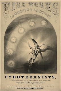
When I was researching I found the poster/advertisement on the right and was inspired by it. I think that the interesting typefaces with help to take my design to the next level. This idea is in the very early stages. I still need to track out type, make revisions and look for paper.0


No comments:
Post a Comment