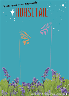
This is the printed copy after the peer critique. Some of the suggestions included adding a small gradient to the sky, making where the flowers stop less linear, creating variations through flower size, making the branding on the bottom more known and purposeful, making the type larger and possibly adding more to it to draw attention to it.
I have already started work on changing the flowerbed and researching type for the world's fair.
Tuesday, September 25, 2012
Seed Packet update
The piece to the left is what I printed for the peer critique today. This is a completely different direction from what I was trying to do before. I received inspiration from the space Mountain poster below. I thought the style was working very well so, I attempted to apply it to may own work.


To the left are the other two seed packets in the state I had them in for today. they are the other two packets for the series, two other types of fireworks, horsetail and kamuro. I obviously still need to add the flowers to kamuro and I want to add more fireworks with gradients to both.


To the left are the other two seed packets in the state I had them in for today. they are the other two packets for the series, two other types of fireworks, horsetail and kamuro. I obviously still need to add the flowers to kamuro and I want to add more fireworks with gradients to both.
Sunday, September 23, 2012
Seed Packet
This is the piece I printed for the critique and got feedback on. My feedback included adding background color and possibly moving the type to the top.
Thursday, September 20, 2012
Firework Video Research
It was suggested that I look at videos of fireworks to see their progression. These first few pictures are of the effect I am doing for the first packet, comet. Since the colors are the same throughout I am debating about changing the colors to make them more recognizable. This will again bring up the problem of needing a dark background possibly. Also, I am going to look into a tutorial to try to add a shine or glow to the tops.
The next images show the progression of the other fireworks I plan on doing for the packets, Horsetail and Kamuro. I feel that overall these will be more exciting and take up more space. Fading in and out are very important. In the last few screen shots are pictures of the finale. I thought the amount of smoke and the trails of smoke were visually interesting and I may try to figure out a way to include it.
Different Ideas
Building off of my last post these are the different ideas I am working through to make the packet itself more exciting. I am also exploring paper.
I was trying to create a night sky feel to the top through the gradient. I enjoy the addition of color but, I feel that it is not enough and I am not sure where to go on this one from here.
Originally, I was exploring pattern I just did not include it in the print out because I am not sure that it is working yet. I definitely feel that it gives a playful and firework-like feel but, even at this low opacity I feel like the pattern is competing too much with the flower and fireworks.
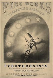
When I was researching I found the poster/advertisement on the right and was inspired by it. I think that the interesting typefaces with help to take my design to the next level. This idea is in the very early stages. I still need to track out type, make revisions and look for paper.0
I was trying to create a night sky feel to the top through the gradient. I enjoy the addition of color but, I feel that it is not enough and I am not sure where to go on this one from here.
Originally, I was exploring pattern I just did not include it in the print out because I am not sure that it is working yet. I definitely feel that it gives a playful and firework-like feel but, even at this low opacity I feel like the pattern is competing too much with the flower and fireworks.

When I was researching I found the poster/advertisement on the right and was inspired by it. I think that the interesting typefaces with help to take my design to the next level. This idea is in the very early stages. I still need to track out type, make revisions and look for paper.0
Thursday, September 13, 2012
Seed Packet POV
After doing research for images and information and creating my mood board I have a rough idea of how I would like to design my seed packet. The three different packets will be three firework effects; crossette, kamuro, and horsetail. I chose these three based on their visual appearance and how different they are from one another. The typeface I am leading towards right now is Desdemona for the headlines. I am planning on having an underlying texture/pattern throughout the piece, possibly something similar to the patterns included in my mood board. My overall concept is that one would plant the seeds in the packet and a flower that looks similar to the packaging would bloom. Once it was fully bloomed it plays off the he loves me, he loves me not idea in that when one lights a petal a firework will shoot off. If someone were to sent off all the petals a fireworks show would essentially occur. I am still working on company names but I have ideas like Bloom Blast Company, Blast Bloom or Blast Garden.
Subscribe to:
Posts (Atom)